We are so, so excited to introduce y'all to our newest contributor, and first ever interior design contributor, Kelsey Wells of The Wells Collection. Kelsey studied interior design at Brigham Young University, then got a job as a designer at Ethan Allen, and recently left to start her own design business. She is a wealth of design knowledge and DIY projects and we cannot wait for you to "meet" her! Her blog is brand, brand new, so be sure to give her some love! Oh, she is also Jess's sister!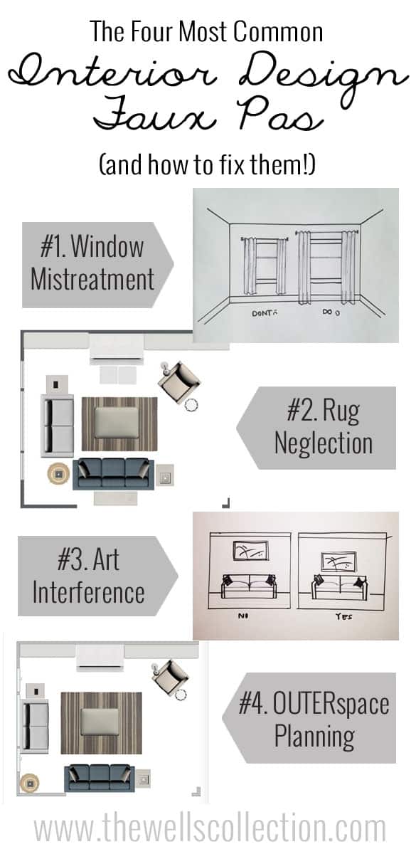
Don't wear white after labor day.. no candybars for breakfast.. shower daily (girl, please).. don't wear black with blue.. no jumping on the bed.. I call BS. On the other hand, however, socks should NEVER be worn with sandals. And leggings really should never be worn as pants. Really.
While there are plenty of rules in interior design I feel I had to learn just so I can break them, today's post is about the ones that are in the "no socks with sandals" camp. Because although ignorance can be bliss, when I come home and realize I have been walking around with my baby's poop all over my blouse (that smell WAS me), ignorance is not bliss. Ignorance is embarrassment, and why couldn't someone just tell me?!
Well, this is me telling you. Today I am your interior-design sister or BFF, and I've got your back. PLEASE know my intentions for this post are certainly not to offend anyone, I simply feel these things are too easy to fix not to be shared. SO, without further ad0 I give you…
THE FOUR MOST COMMON INTERIOR DESIGN FAUX PAS
1. Window MIS-treatment
Window Treatments are SO important to a space, and though I could easily do a whole post just about window do's and don’ts, here are the basics to making your windows fabulous.
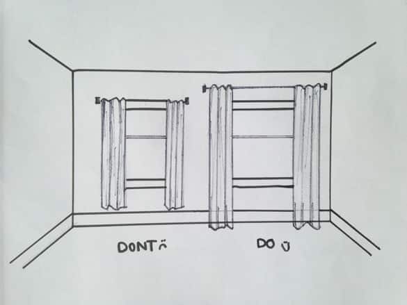
LENGTH- Window treatments MUST touch the floor. They can be barely kissing it, or dragging by a few inches, but the hem of your panels needs to meet the floor.
WIDTH- Maximize the width of your windows! Panels should frame your window, not cover it up. Drapery Panels should be hung so that when gathered, they barely cover the edge of the window. This will give the illusion that the window is bigger than it is, and maximize your natural light.
HEIGHT- Instead of hanging your rod directly on top of the window, bring it up! Ideally, the rod should be hung half-way between the top of the window and your ceiling. This brings the eye continuously from floor to ceiling, elongating your space instead of chopping it up.
The windows in the sketch below are exactly the same size- check out what a difference it makes when you treat your windows right!
2. Rug Neglection
RUGS ARE THE BOMB! Use them. Love them. Put one in every room. But for real, I use a rug in almost every single space I design. Even on carpet you may ask? ABSOLUTELY. An area rug will define your conversation space, give depth to your design, and save your flooring. Not to mention rugs bring the opportunity to make a statement! Whether neutral or vibrant, nothing introduces the style in a space faster than a rug, or makes a bigger impact.
Rugs are definitely an investment, but they are one worth making, and they don't have to break the bank. As someone who used to design with rugs upwards of $4000 each, you can imagine my joy when I discovered a little something called RUGSUSA.COM. A blessed land where you can get a %100 wool, hand knotted masterpiece for around $300! Even less depending on the material. Check it out, and never buy anything unless it is at least half-off, as they have sales all the time. [Also - check out our ever popular cheap rug roundups for more ideas!]
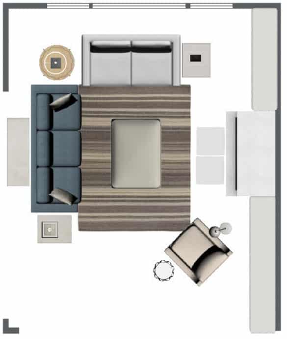
Now that we are all about the rug lovin, let's remember to get the right sizes. The rule is simple: an area rug should at least meet the feet of the furniture on both sides of the space. You do not want to disservice your room by going too small. The wrong size rug brings your eye in, making the room feel smaller and disrupting the flow. 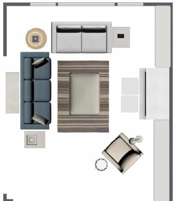
3. Art Interference
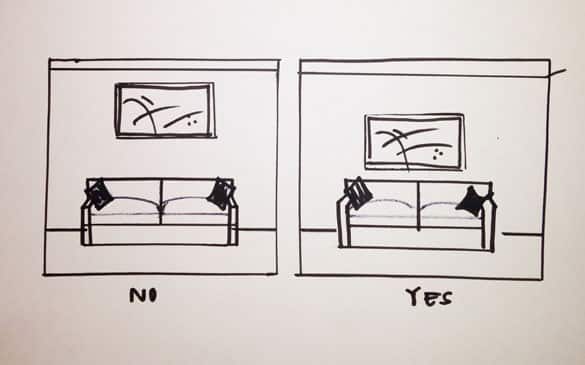
I'm not in the NBA, and I am going to venture a guess and say that most of your house-guests aren't either. This means that your art should NOT be hung eye-level to someone who is 6'10. There is a common misconception that hanging art and wall décor higher will bring the eye up and create height in your space. In actuallity, when art and decor is hung too high it creates a disconnect between the art and furniture, halting the harmony of your space. Art should generally be hung 63" above the floor, or so the center of the piece is eye-level to someone who is about 5'6".
4. OUTERspace planning
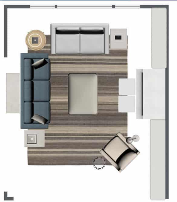
Space planning is the foundation of every room, and having your furniture set appropriately makes a huge difference. The fourth most common design faux pas, is having your furniture pushed up against the walls, or to the edge of the room in an open floor plan. With few exceptions, main furniture pieces should never be directly against the wall. Even in small spaces there should be a few inches between. When one piece is anchored against a wall, the others should be brought to it, not shoved all the way against the opposite wall. This is another way area rugs can come in handy, as a guide to help you space plan.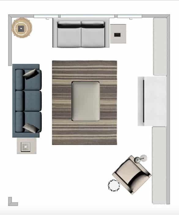
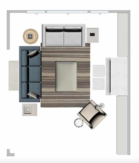
Well there you have it! The four most common interior design faux pas. Now you know them, give them a shot! Make adjustments where needed and you will be amazed at what a difference fixing these common faux pas will bring to your space.
For more design tips, tricks, and inspiration, be sure to follow along over at The Wells Collection! You can also find me on instagram, pinterest (be my first follower, haha) and here is the blog!
Until next time,
xoxo




Sarah @ Pretty Providence
Ahhh! When we first moved into our house we hung up 84" curtains over our windows, then started watching a design show (American Dream Builders) and realized they kept saying to lift the curtains higher so we went around and got longer curtains and now we have them higher up and touching the floor. It makes a huge difference! I am loving these tips for furniture/ space planning though - that is still so hard for me to figure out. Especially working with hand-me-downs that I don't get to choose myself!
Ryan
Everything I thought I knew...was wrong! Thanks!
Laura S.
Great set of faux pas! Many of these (especially #4!) are things that I definitely would have done otherwise! Saving this one for sure! Glad to see a new face around too!
xo, Laura
laurasbestlife.com